Are you a food photographer looking to take your food styling to the next level? Adding color and contrast to photos is a great way to take your food styling to the next level and make your photos stand out. Whether you’re a professional food photographer or just starting out, this article will provide useful tips and techniques on how to add color and contrast to your photos. Color and contrast can be used to create depth and texture in a photo, as well as enhance the overall aesthetic of the image. By using the right colors and contrast in your photos, you can make them look more vibrant, dynamic, and eye-catching. In this article, we’ll discuss how to effectively use color and contrast in your food photography, as well as some tips and tricks for creating stunning images.
Adjusting White Balance Settings
White balance is an essential tool for achieving accurate colors in your photos.It helps to adjust the color temperature of your photos so that the colors appear more true to life. By adjusting the white balance settings, you can add more accurate colors to your photos and make them look more vibrant and realistic. Different white balance settings will affect the colors of your photos in different ways. For example, setting your white balance to “Tungsten” will give your photos a warmer tone, while setting it to “Fluorescent” will give your photos a cooler tone.
Similarly, setting your white balance to “Daylight” will give your photos a bright, sunny look, while setting it to “Auto” will automatically adjust the white balance based on the light conditions. By experimenting with different white balance settings, you can achieve better colors in your photos and make them look their best. For example, if you want to emphasize the warm tones in a photo of a sunset, you can set your white balance to “Tungsten”. On the other hand, if you want to emphasize the cool tones in a photo of a snowscape, you can set your white balance to “Fluorescent”.
By adjusting the white balance settings, you can achieve stunning results that will make your food look its best.
Exploring Natural Light and Flash Photography
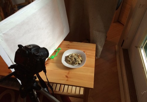
Natural Light PhotographyNatural light photography is a popular choice for food styling as it is often softer, warmer, and more flattering than using flash. Natural light has the advantage of being easily manipulated with the use of reflectors or diffusers, or simply by moving the food closer to or farther away from the window. This can create a range of effects, from soft and dreamy to brighter and sharper images. Using natural light has its disadvantages as well; it can be difficult to control, especially on a bright day, and can cause strong shadows. To minimize this, you can use diffusers or flags to block out the strongest light and help even out the exposure.Flash PhotographyFlash photography is another option for creating stunning food images.
Using flash can give you a lot of control over your images, as you can adjust the power of the flash and its direction to create different effects. It can also help to fill in shadows and minimize overexposure. When using a flash, you can use a variety of techniques to soften and shape the light. Bouncing the flash off of a wall or ceiling, or using reflectors or diffusers can all help to create beautiful, even lighting.
Applying Post-Processing Techniques in Photo Editing Software
Post-processing is an essential part of any food photography style. This is because it allows you to enhance colors and contrasts in your photos, which can make a huge difference in the end result.In this section, we’ll discuss how post-processing techniques in photo editing software can help you achieve better results in your photos. One of the most common post-processing techniques used in photo editing software is sharpening. Sharpening helps to bring out details and make the image appear sharper and more vibrant. You can adjust the level of sharpening to suit your desired effect. Another popular post-processing technique is adjusting the vibrance or saturation of a photo.
This can help to bring out the colors and make them more vivid. You can also adjust the hue and saturation of a photo to create interesting effects. Curves adjustments are another important post-processing technique that can be used to enhance colors and contrast. Curves adjustments allow you to adjust the brightness and contrast of different areas of the image. This can be used to draw attention to certain elements or to soften harsh shadows. Finally, it’s important to note that these post-processing techniques should be used in combination with other styling techniques, such as lighting, composition, and props, in order to achieve the best results.
By using post-processing techniques in combination with other styling techniques, you can create stunning images with vibrant colors and interesting contrasts that will make your food look its best.
Using Props and Food Styling Tools
Adding color and contrast to photos can be greatly enhanced with the use of props and food styling tools. Props can include anything that adds interest and contrast to a photo, such as dishes, cutlery, napkins, placemats, tablecloths, and other items. By carefully selecting props that complement the food and background, you can create stunning images with vibrant colors and interesting contrasts that will make your food look its best. For example, if you’re photographing a plate of pasta, a brightly colored napkin or placemat can add great contrast against the white plate and provide a lovely backdrop for the pasta. Similarly, if you’re photographing a sandwich on a cutting board, you can use colorful dishes or utensils to enhance the composition.Additionally, tablecloths or large fabric swatches can add depth and color to an otherwise plain background. In addition to props, food styling tools can also be used to add color and contrast to photos. For example, spoons, forks, tweezers, and small brushes can be used to arrange food in interesting ways. You can use these tools to arrange food in unique compositions or to add texture and contrast. For example, by using tweezers to place small pieces of herbs or spices on the food, you can create an interesting pattern that will draw the eye. Using props and food styling tools is an easy way to add color and contrast to your food photography.
By carefully selecting items that complement the food and background, you can create stunning images with vibrant colors and interesting contrasts that will make your food look its best.
Making Use of Color Theory
Color theory is a powerful tool for creating images with impact. By understanding the basics of color theory, you can use color palettes to create interest and add depth to your food photography. At its most basic, color theory is the study of how colors work together to create an overall effect. It is a combination of scientific principles and artistic practice, and it can be used to great effect when adding color and contrast to photos.Monochromatic Color PaletteA monochromatic color palette uses one color in different shades and tints. This type of palette is often used to create a subtle look that is calming and unified. To create a monochromatic palette for food styling, select a color that you think will work well for your photo, such as a bright yellow, muted green, or deep blue. Then pick shades of the same color for each element in your photo – for example, you could use a bright yellow for the background, a light yellow for the plate, and a darker yellow for the food itself.
Analogous Color PaletteAn analogous color palette combines colors that are next to each other on the color wheel. This type of palette often creates an interesting visual effect, as the colors complement each other while still providing contrast. For example, you could combine a yellow with an orange or a blue with a green. This type of palette can be used to create a vibrant and eye-catching look for your food photography.
Complementary Color PaletteA complementary color palette uses two colors that are opposite each other on the color wheel. This type of palette creates a high contrast look that is often used to make objects stand out. For example, you could use a bright yellow with a deep blue or an orange with a purple. This type of palette is often used to create an interesting and dynamic look in food styling photos.
Split Complementary Color PaletteA split complementary color palette combines three colors – one primary color and two colors that are adjacent to its complement on the color wheel. This type of palette creates a dynamic and interesting look that can be used to draw attention to certain elements in your photo. For example, you could combine yellow with green and blue or orange with purple and blue. By understanding the basics of color theory and using different color palettes effectively, you can add depth and interest to your food photography. Experiment with different combinations of colors to find the perfect palette for your photos. Adding color and contrast to photos can make a huge difference in the quality of your food photography.
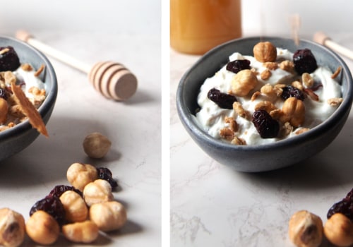
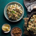
With natural light and flash photography, white balance settings, props and food styling tools, as well as color theory and post-processing techniques, you can create stunning images with vibrant colors and interesting contrasts. By following these tips, you can ensure your food photography stands out from the rest. For example, take a look at the photo below. By adding color and contrast, you can see how the overall appeal of the image has been greatly improved.


Leave a Comment